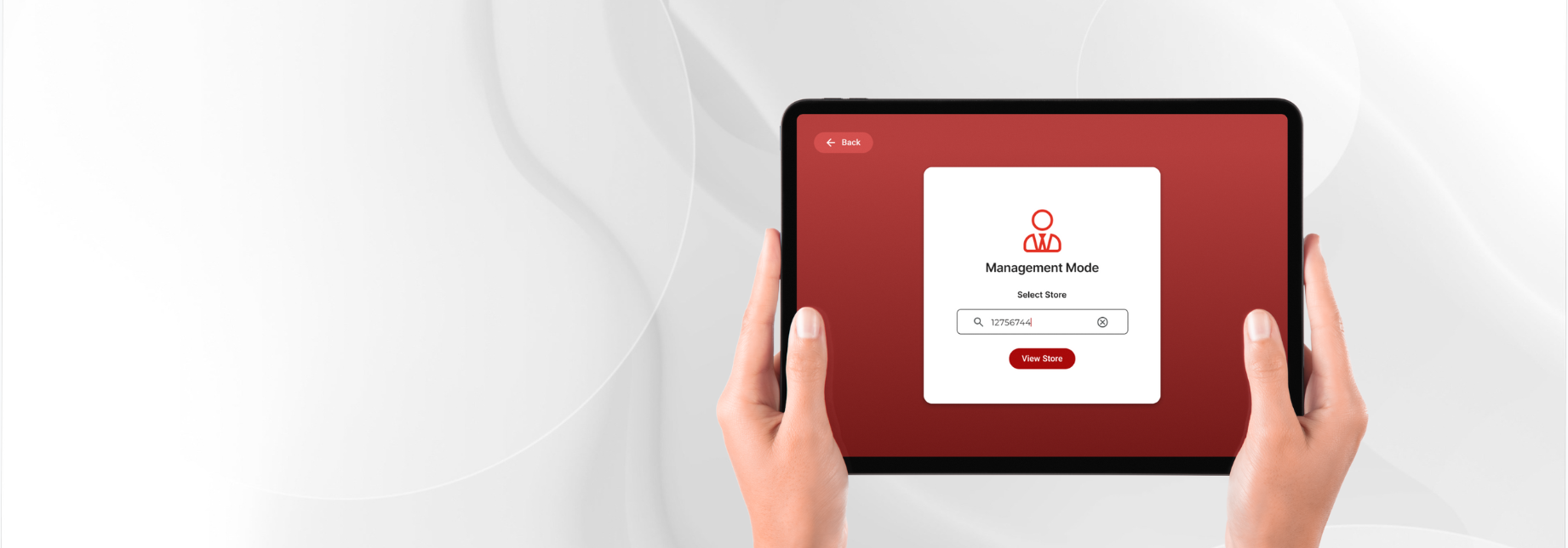
Retail · store operations
Store Operations Platform - Circle K
01 — Overview
Circle K, with 15,000+ locations, was limited by a manual, single-platform Task Management system that lacked the scalability and cross-platform flexibility. Store associates and managers faced poor usability, fragmented communication, and disconnected workflows — leading to low engagement, inconsistent execution, and delayed decisions.
Key Impact
40%
Increase in User Satisfaction
Iterative user research and usability testing improved the overall user experience and confidence in completing day-to-day tasks.
25%
Faster Task Completion
Validated workflows through usability testing, reducing the time required for store staff to complete operational tasks.
20%
Reduction in Design & Development Time
Built a scalable, modular design system that accelerated design and engineering across multiple devices.
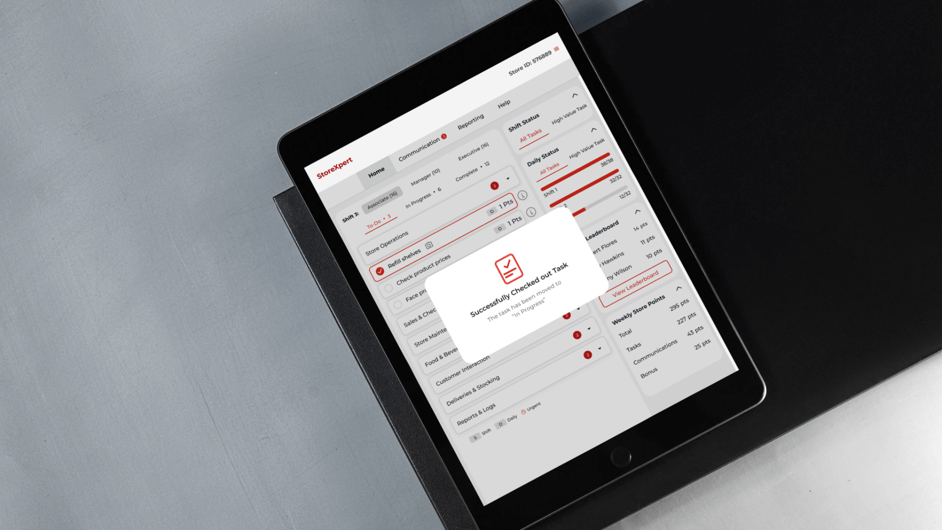
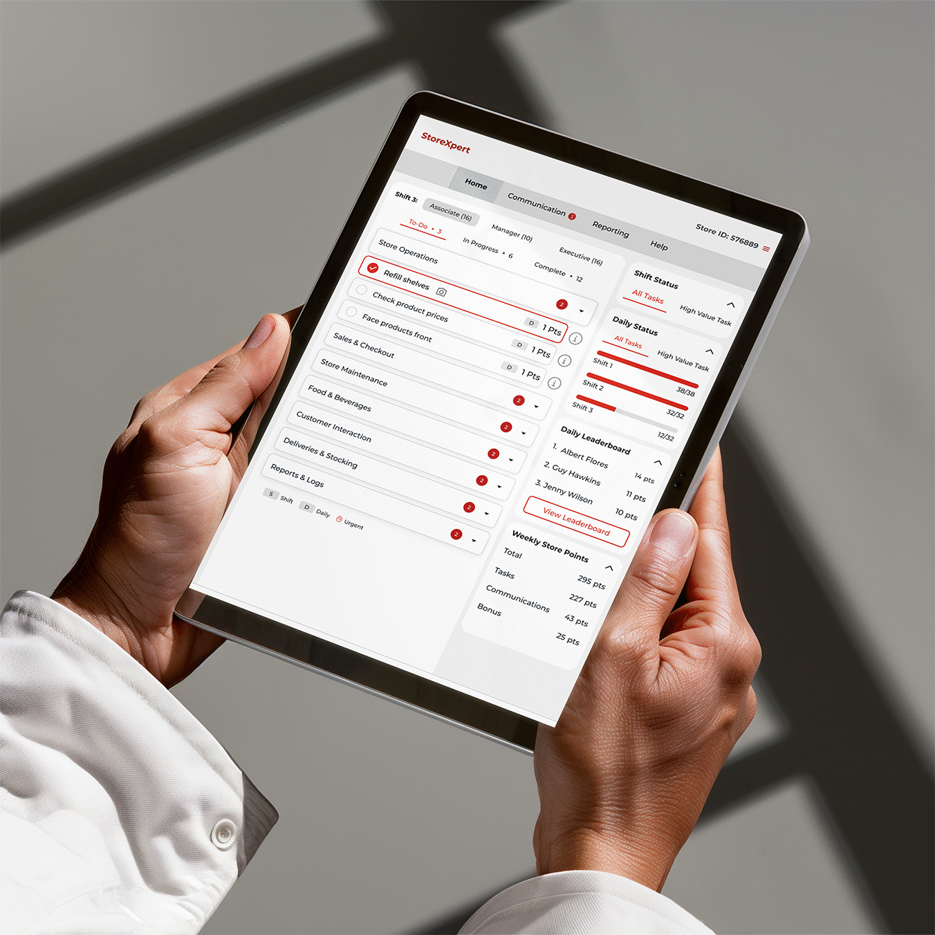
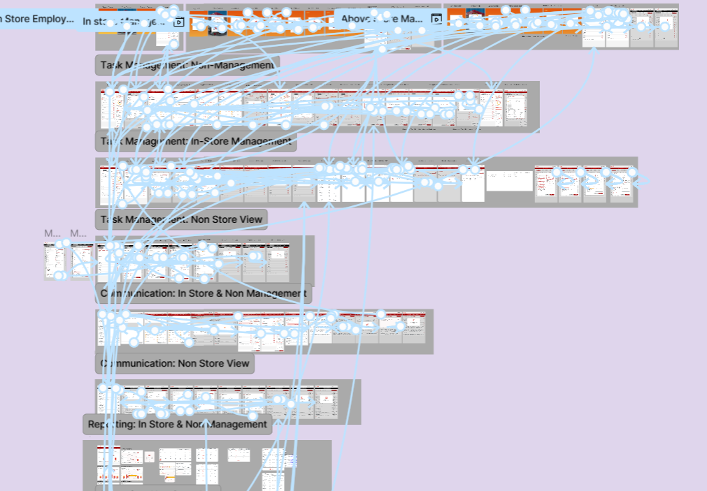
The modular design system that let one change reach web, kiosk, iPad, and mobile at once.
02 — My Role
From Pitch to Delivery
Led foundational UX research that uncovered key user pain points and helped shape the proposal, contributing to winning the project.
Owned the end-to-end design process, from defining the redesign scope and refining workflows to delivering high-fidelity designs across platforms.
Built a scalable, modular design system to ensure consistency and accelerate implementation.
Partnered closely with the Technology Head and Business Analyst to align design decisions with business and technical goals.
Onboarded and mentored new designers, ensuring a smooth transition and maintaining design quality throughout the project.
03 — Project Goal
Design a scalable, cross-platform task management experience that unified communication and streamlined workflows across store operations.
An evaluation of the existing system identified low task engagement, cluttered interfaces, inconsistent cross-device experiences, and inefficient workflows. These insights informed the design of a modular design system and responsive experiences across Web, Kiosk, iPad, and Mobile, resulting in faster task completion, improved user satisfaction, and more efficient design and development.
Phase 01
Opportunity Discovery & Proposal
04 — System Analysis & Key Findings
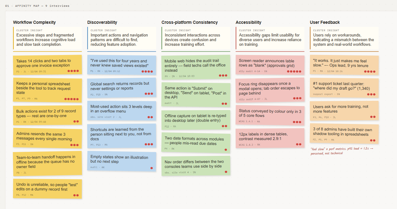
To understand the existing experience, I conducted a heuristic evaluation alongside stakeholder discussions and user interviews. The findings revealed recurring usability issues that became the foundation for the redesign.
| Theme | What it revealed |
|---|---|
| Workflow Complexity | Tasks required unnecessary steps, increasing completion time and cognitive load. |
| Discoverability | Users struggled to locate common actions and information. |
| Cross-platform Consistency | Interaction patterns varied across devices, creating friction. |
| Accessibility | Contrast, labels, and feedback mechanisms limited usability for diverse users. |
| User Feedback | Existing workflows didn't align with how store teams actually worked. |
05 — Concept Exploration
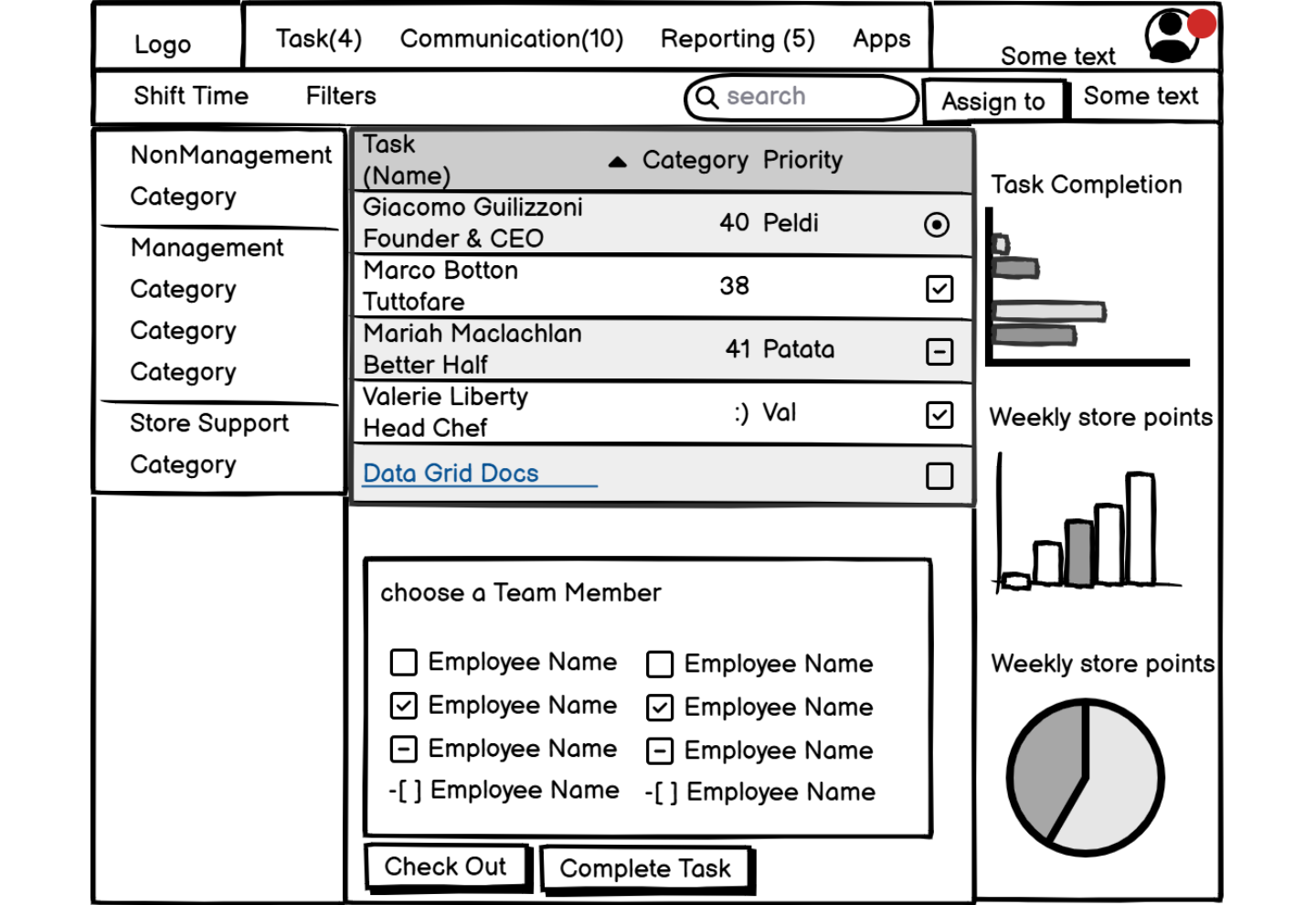
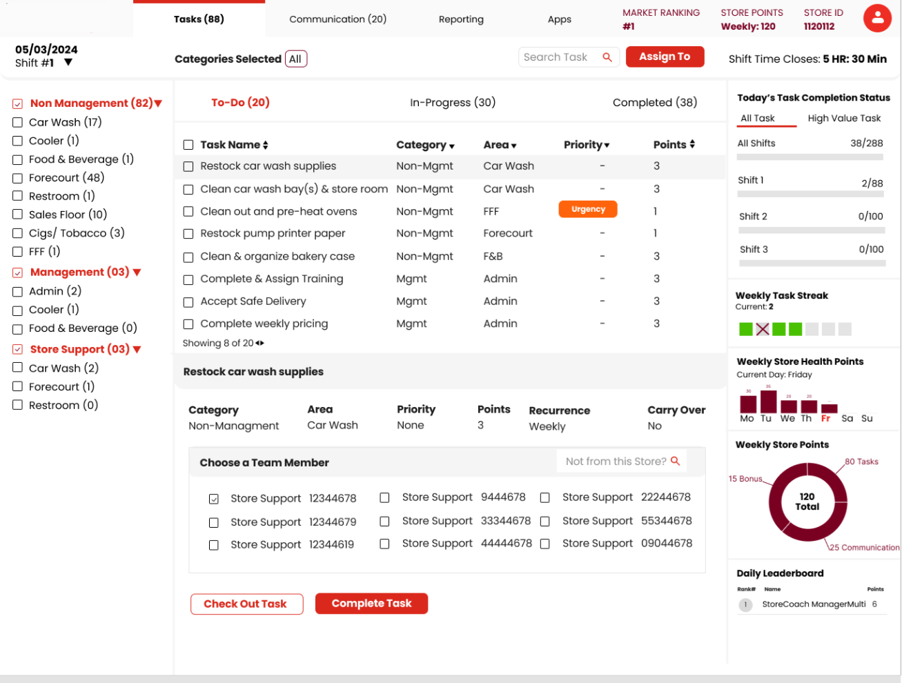
Early wireframes and high-fidelity concepts were created in parallel to quickly communicate the vision, validate interaction patterns, and align stakeholders before detailed design began.
06 — Vision Walkthrough
To support the RFP, I translated research insights into a compelling design narrative through wireframes, high-fidelity concepts, and a walkthrough video. This helped stakeholders visualize the future experience, align on the redesign strategy, and contributed to the project's successful proposal.
Phase 02
Project Execution
07 — Project Kickoff & User Understanding
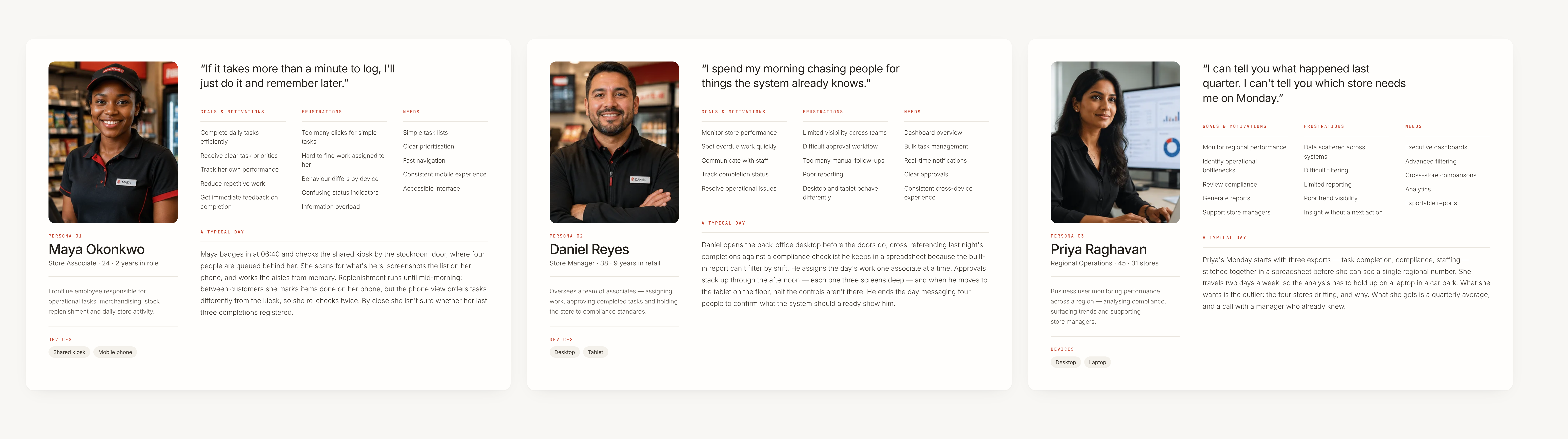
With the project approved, the focus shifted from validating the opportunity to understanding the users in greater depth. I collaborated with stakeholders to define personas, understand role-specific responsibilities, and uncover contextual workflows that informed the production-ready solution.
08 — Design Strategy & Information Architecture
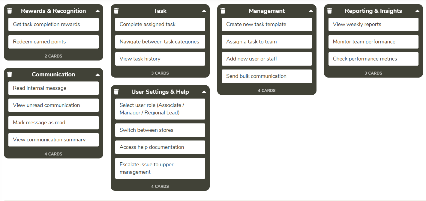
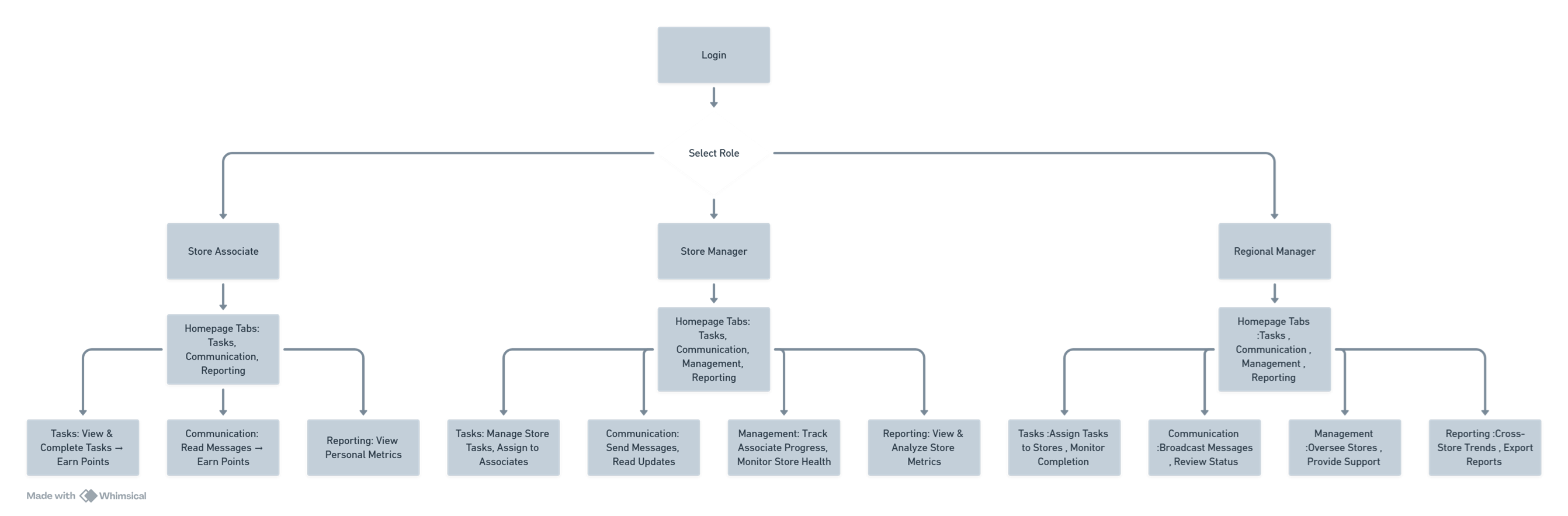
With a deeper understanding of user roles and workflows, I defined a design strategy that prioritized the tasks users performed most frequently while addressing the highest-impact usability issues. For the first release, the focus was on delivering targeted improvements within the constraints of the existing platform, balancing user needs with technical feasibility.
User flows were simplified and the information architecture was restructured to create a clearer navigation model, improve content discoverability, and support efficient task completion across Web, Kiosk, iPad, and Mobile.
09 — Building a Scalable Design System
To support a multi-platform experience and accelerate delivery, I developed a modular design system in Figma using Material UI as the foundation. Reusable components, standardized interaction patterns, and responsive layouts reduced design duplication and simplified developer implementation, contributing to a 20% reduction in design and development effort across the project.
10 — Iterative Design & Feedback Loop
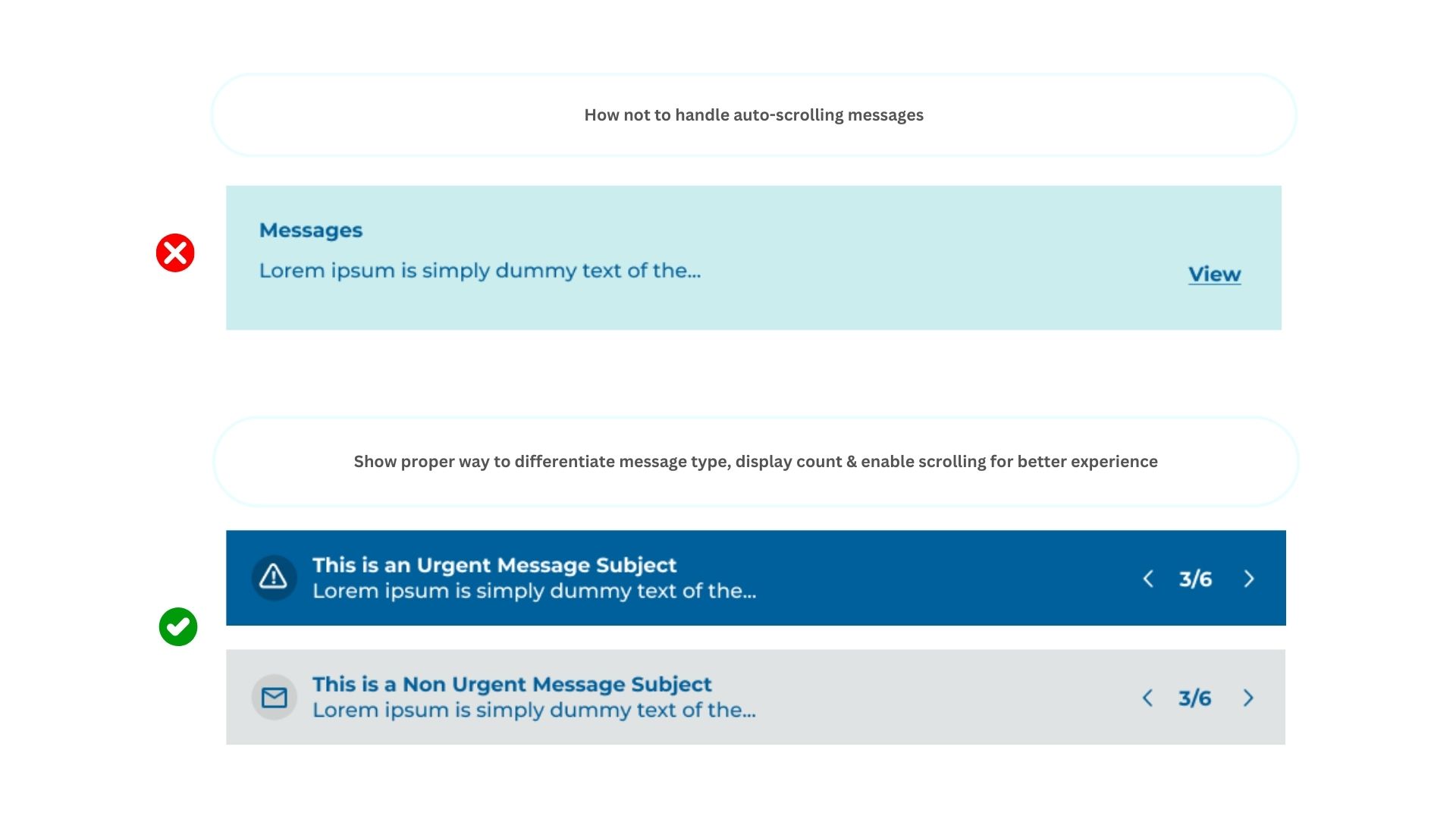
With an accelerated delivery timeline, the design process followed a continuous feedback loop rather than a linear handoff. Weekly design reviews with the Business Analyst and development team were used to validate technical feasibility, refine workflows, and align implementation priorities.
Close cross-functional collaboration enabled rapid iteration while maintaining consistency with the design system, adhering to brand guidelines, and keeping the solution focused on the agreed project scope. This iterative approach reduced rework and ensured a smooth transition from design to development.
11 — Accessibility by Design
Accessibility was embedded throughout the design process rather than treated as a final compliance check. The experience was designed to align with WCAG 2.1 AA guidelines, ensuring users could navigate and complete tasks confidently across different devices and assistive technologies.
Key Accessibility Considerations
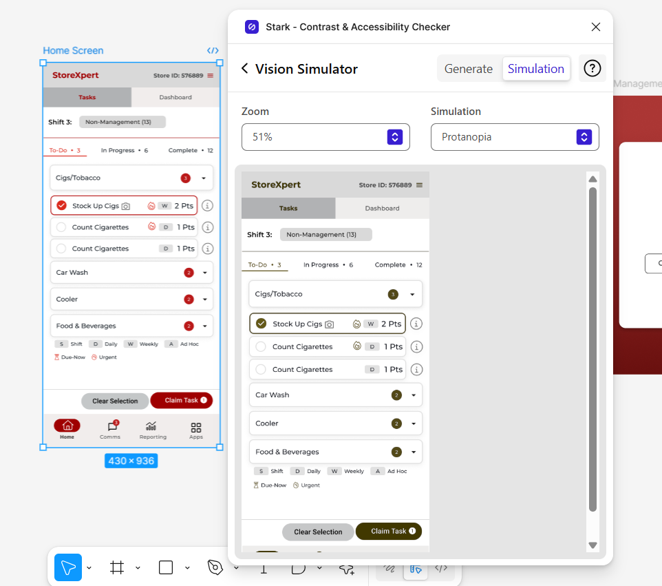
Colour & Contrast
Ensured text and interactive elements met WCAG 2.1 AA contrast requirements to improve readability and support users with colour vision deficiencies.
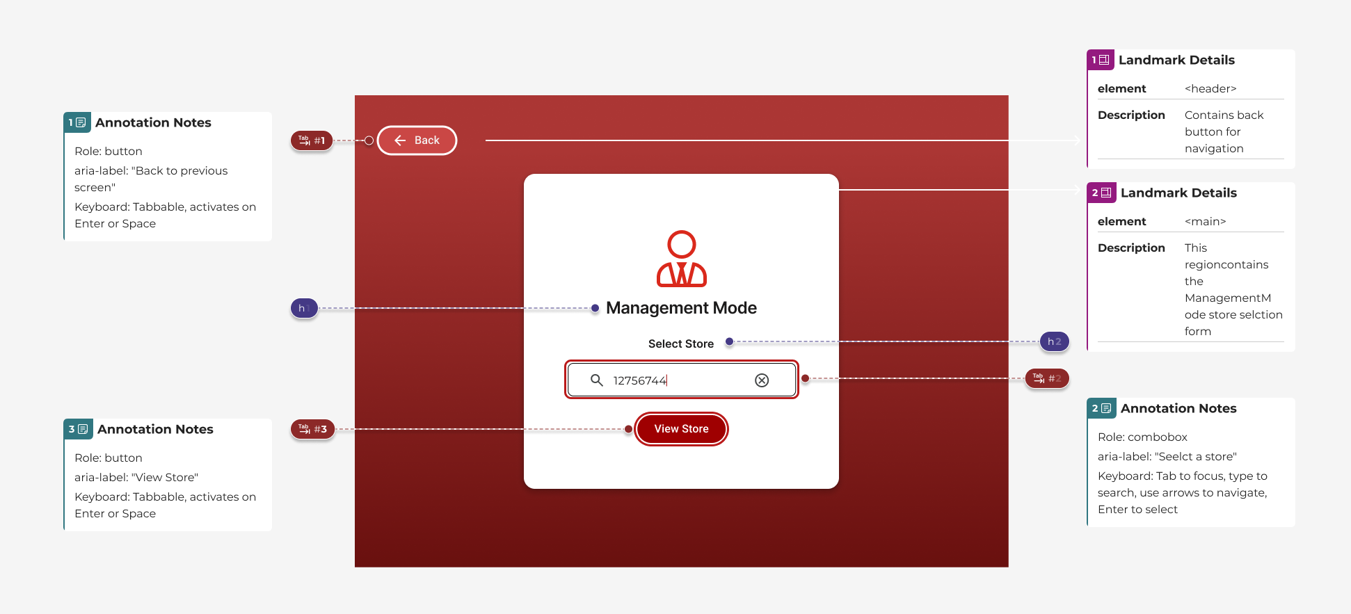
Keyboard Navigation
Designed clear focus states and a logical tab order, enabling efficient navigation without relying on a mouse.
Semantic Structure
Established a consistent heading hierarchy and meaningful semantic structure to improve screen reader compatibility.
Assistive Technology Support
Applied appropriate ARIA labels and interaction states to provide context and feedback for assistive technologies.
12 — Prototyping & Developer Handoff
High-fidelity interactive prototypes were developed across Web, Mobile, Kiosk, and iPad to validate key workflows, responsive behaviours, and interaction patterns before implementation.
To support a seamless transition into development, I delivered comprehensive handoff documentation including annotated specifications, reusable components, design tokens, accessibility guidance, and a shared design system. This established a single source of truth for engineering and helped accelerate implementation while maintaining design consistency.
13 — Decisions
Decision 01
One modular design system, not four separate redesigns
What was true
The same task views had to work as a kiosk touch interface, a store manager's iPad, a phone in an associate's hand, and a desktop web view — and every prior update meant editing all four separately.
What I chose
Built a component-based design system in Figma, tailored to the brand and to StoreXpert's structure, so a single change to a component propagated automatically across every device view.
What I rejected
Redesigning each platform's screens independently for speed. It would have hit the Phase One deadline faster but guaranteed the same maintenance problem the project was meant to fix.
What it cost
Slower to the first shippable screen, because the system had to be built before most individual screens could be finished.
Decision 02
Phase One is disciplined enhancement, not a rebuild
What was true
Initial analysis found real structural problems — cluttered headers, inconsistent presentation of the same information, invisible system feedback — but store teams also depended on the system being recognisable from one release to the next.
What I chose
Scoped Phase One to the highest-severity usability violations (see Evidence 01) and kept the existing structure largely intact, so store staff experienced continuity, not a relearn.
What I rejected
A full IA and visual overhaul in one release. It scored better on paper but risked the operational disruption the client was explicitly trying to avoid.
What it cost
Some known issues — lower-severity, lower-occurrence ones — were deliberately left for a later phase rather than fixed immediately.
Decision 03
Design for the store floor's accessibility needs, not just compliance
What was true
Store associates use this system standing at a kiosk, often quickly, in variable lighting — conditions where colour-contrast and keyboard/focus problems compound faster than they do at a desk.
What I chose
Validated every interactive surface against WCAG 2.1 AA using a colour-deficiency simulator and explicit keyboard-focus testing, not just automated contrast checks.
What I rejected
Treating accessibility as a final QA pass against a checklist. Testing with a vision simulator during design, not after, changed specific component choices (see Evidence 04).
What it cost
Added a review step to every component before it entered the system library, which slowed the system's initial build-out.
14 — Reflection
From shaping the proposal to delivering the final experience, this project strengthened my ability to bridge business goals, user needs, and technical feasibility through design.