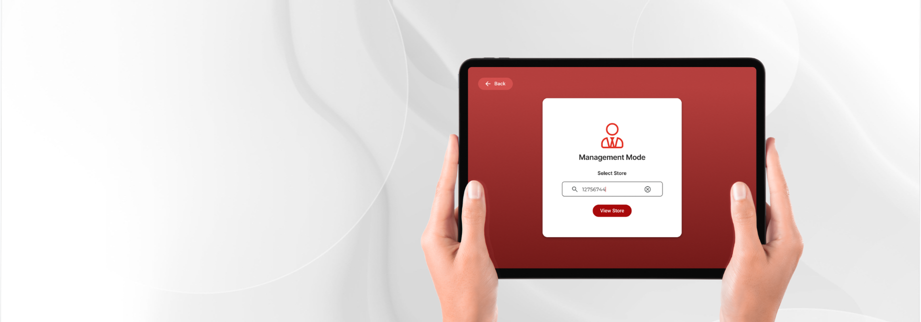
Retail · store operations
Store Operations Platform - Retail Task Management
Overview
A global convenience store chain with 15,000+ locations was using an internal task management platform designed to support task management, communication, and reporting among store employees, managers, and above store leadership.
Despite its intended purpose, the platform suffered from low adoption limiting operational visibility across stores.
Key Impact
40%
Increase in User Satisfaction
Iterative user research and usability testing improved the overall user experience and confidence in completing day-to-day tasks.
25%
Faster Task Completion
Validated workflows through usability testing, reducing the time required for store staff to complete operational tasks.
20%
Reduction in Design & Development Time
Built a scalable, modular design system that accelerated design and engineering across multiple devices.
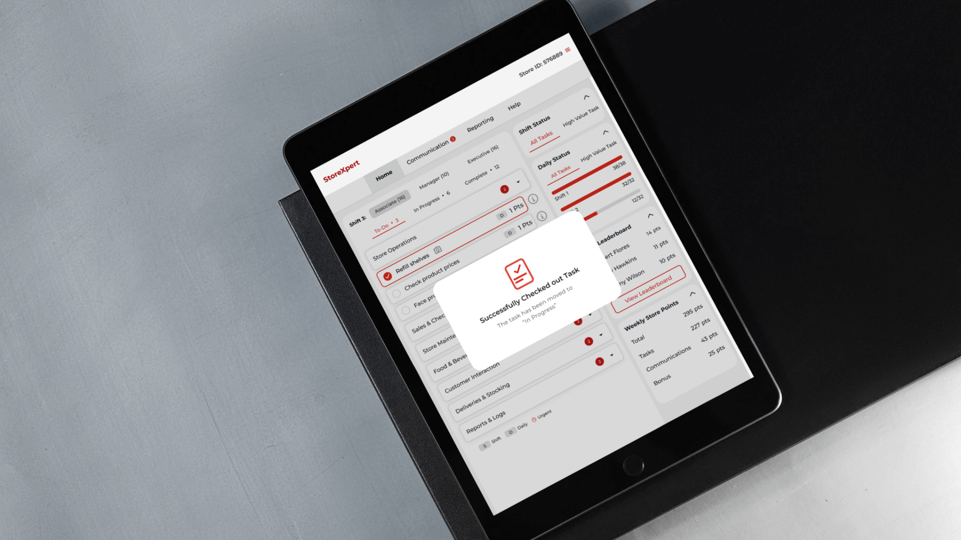
The modular design system that let one change reach web, kiosk, iPad, and mobile at once.
01: My Role
From Pitch to Delivery
Led foundational UX research that uncovered key user pain points and helped shape the proposal, contributing to winning the project.
Owned the end-to-end design process, from defining the redesign scope and refining workflows to delivering high-fidelity designs across platforms.
Built a scalable, modular design system to ensure consistency and accelerate implementation.
Partnered cross-functionally with Product, Business, Design, Technology, Engineering, and QA teams to align user needs, business goals, and technical constraints.
Onboarded and mentored new designers, ensuring a smooth transition and maintaining design quality throughout the project.
Phase 01
Opportunity Discovery & Proposal
02: The Problem I Was Solving
What stakeholders thought
The low adoption was primarily a result of device and screen-size limitations.
What I saw as an opportunity
Investigate why store teams weren't consistently adopting and using the platform whether device compatibility was truly the barrier or whether deeper usability and workflow issues were at play. Rather than simply lifting and shifting the existing experience to new devices, I saw an opportunity to understand how store teams actually manage and complete tasks, and redesign the experience around their needs.
How I investigated
- Walkthrough of the deployed application
- Heuristic evaluation of the existing experience
03: The Discovery
Walkthrough of Existing Application
I walked through the deployed application to understand the existing login, role-based access, task discovery, claiming, and execution flows.
This revealed a dense, fragmented workflow with unclear navigation and task relationships, suggesting the usability challenges went beyond device compatibility.
Heuristic Analysis
Heuristic evaluation of the current platform UX and UI
| Issue Identified | Heuristic Violated | Impact on Experience | Real-World Risk / Observation |
|---|---|---|---|
| Any user can claim tasks intended for another role | Error Prevention | Incorrect task execution; lack of access control | Unauthorized task handling; data becomes unreliable |
| No validation of user identity before claiming a task | Visibility of System Status; User Control and Freedom | Accountability gaps; no clarity on who did what | Tasks may be completed under someone else's name, breaking audit trail integrity |
| Store employees can view tasks assigned to higher roles (e.g., managers), even if they can't claim them | Match Between System and Real-World | Undermines role clarity; introduces confusion or misuse potential | Employees can monitor manager task lists, causing hierarchy breakdown or trust issues |
| Issue Identified | Heuristic Violated | Impact on Experience | Real-World Risk / Observation |
|---|---|---|---|
| Header cluttered with excessive content | Aesthetic and Minimalist Design | Visual overload; distracts from primary task actions | Users take longer to locate navigation or filters |
| Inconsistent presentation of the same information | Consistency and Standards | Increases cognitive load; lowers interface predictability | Users may misinterpret data due to differing formats (e.g., dates, labels) |
| Action feedback not visible post completion | Feedback and Visibility of System Status | Uncertainty about task success; trust issues | Users may retry or abandon tasks, leading to duplicates or incomplete workflows |
04: Redefining the Problem
What the business believed
Employees aren't using the platform effectively because it isn't responsive or accessible across key devices like mobile, tablet, desktop, and kiosk.
The proposed solution was to modernize the UI to ensure seamless cross-device usability and improve adoption.
What discovery revealed
The core issue wasn't access, it was broken workflow integrity:
- Shared logins = No accountability
- Lack of task clarity = Missed responsibilities
- Misused gamification = Inflated reports
Making the platform accessible across devices wasn't enough. Adoption happens when workflows are built on clarity, ownership, and trust.
Business Goals
Business Goal 1
Improve Adoption Across Roles and Devices
- Reduce login friction and shared usage.
- Increase platform use across all devices.
- Address behavioral avoidance patterns.
Business Goal 2
Strengthen Ownership and Accountability
- Restrict task visibility by role.
- Track actions by individual users.
- Add audit trails for tasks and communication.
Business Goal 3
Rebuild Trust in Reporting and Task Data
- Prevent inflated or misused task data.
- Improve accuracy of performance reports.
- Reduce reliance on manual workarounds.
Business Goal 4
Deliver a Unified, Inclusive, and Efficient UX
- Standardize UI across platforms.
- Reduce training with intuitive flows.
- Ensure accessibility and brand alignment.
OKR Metrics (tentative / planned)
| Module | UX Goal | Key Metrics to Track |
|---|---|---|
| Authentication | Ensure secure, individual access on shared devices |
|
| Task Management | Enable correct claiming, execution, and tracking |
|
| Communication | Deliver relevant, actionable alerts by role |
|
| Reporting | Rebuild trust in task data and insights |
|
| Management Tools | Improve task creation, team oversight |
|
05: Concept Exploration
Wireframes and hi-fi, in parallel
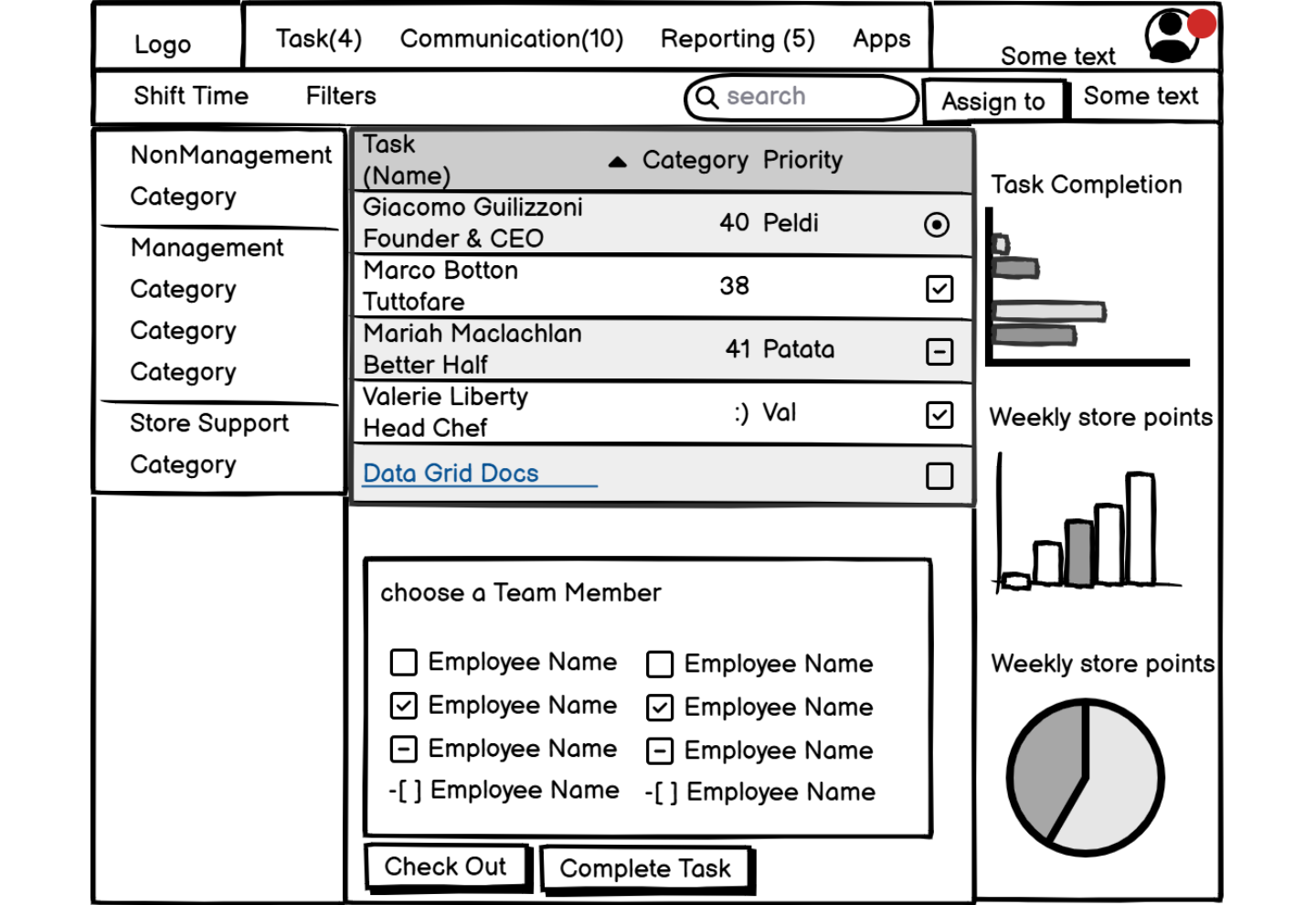
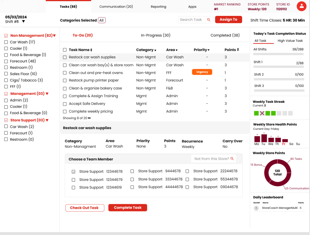
Early wireframes and high-fidelity concepts were created in parallel to quickly communicate the vision, validate interaction patterns, and align stakeholders before detailed design began.
06: Vision Walkthrough
Designing to win the work
To support the RFP, I translated research insights into a compelling design narrative through wireframes and high-fidelity concepts. This helped stakeholders visualize the future experience, align on the redesign strategy, and contributed to the project's successful proposal.
Phase 02
Project Execution
07: Users & Roles
Who actually does what in a store
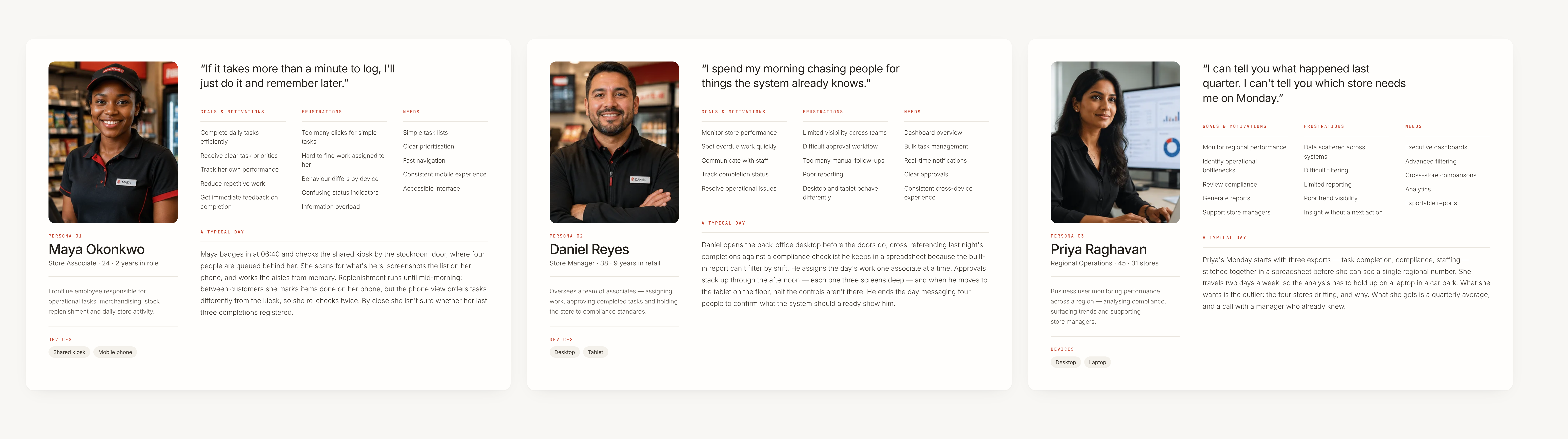
With the project approved, the focus shifted from validating the opportunity to understanding the users in greater depth. I collaborated with stakeholders to define personas, understand role-specific responsibilities, and uncover contextual workflows that informed the production-ready solution.
08: Journey Map
UserJourney - Store Associate
Walked through a full shift, stage by stage, against the shared-kiosk and mobile touchpoints she actually uses — surfacing where the interface's gaps turned a simple task claim into something she couldn't fully trust.
| Stage | User actions | Touchpoints | Pain points / gaps | Emotional state |
|---|---|---|---|---|
| 1.Starts Shift | Walks to kiosk to check today's tasks | Shared kiosk screen | Kiosk still logged in from previous user; she skips personal login | Neutral |
| 2.Views Task List | Sees tasks grouped by role (store, manager, above-store) | Kiosk task list UI | UI cluttered; tasks irrelevant to her are visible | Overwhelmed |
| 3.Claims a Task | Selects a store-level task and clicks “Claim” | Kiosk roster dropdown | Can claim using her name or someone else's; no validation or restriction | Mistrustful |
| 4.Starts Task | Begins task physically (e.g., cleaning shelf) | In-store activity | Nothing wrong here — task work happens offline | Neutral |
| 5.Switches Device | Later, pulls out mobile device to update task status | Personal mobile device | Session still active; claims task completion without re-authentication | Questionable |
| 6.Marks Complete | Updates task as completed | Mobile task screen | No trace of who actually did the task; can't undo or revise after submitting | Disappointed |
| 7.Checks Status | Task disappears or moves to “Completed”; leaderboard doesn't reflect change | Reporting view / leaderboard | No feedback, no audit trail; system doesn't reflect contribution or flag misuse | Skeptical |
09: User Interview
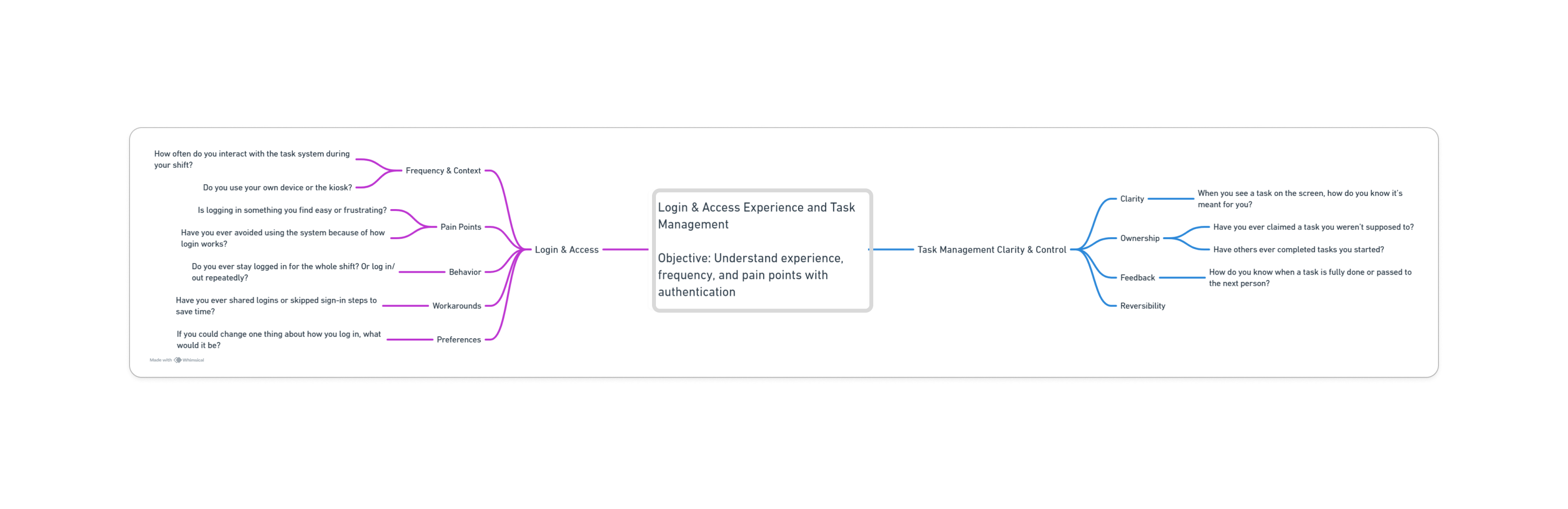
Interview Guide
Login & access experience and task management — objective: understand experience, frequency, and pain points with authentication, then how clearly ownership and outcomes come through once a task is claimed.
Insights & Themes
Affinity-mapped directly from interview transcripts, grouped into the four themes that kept resurfacing across roles.
User Validated Insights
The problem wasn't simply accessing the platform across devices. Users struggled to understand what needed their attention, what they owned, and how their actions affected task progress.
10: Strategy & IA
Design Tradeoff Informed by User Journey and Business Constraints
- Initial Proposal:
- Individual logins for every store employee to ensure task accountability.
- Stakeholder & Technical Concern:
- Logging in/out repeatedly on shared kiosks was seen as disruptive and impractical for store operations.
- Constraint Identified:
- Shared-device usage and fast-paced environments made full login sessions inefficient.
Fit Evaluation — Based on Cross-Device Usage & All Four User Personas
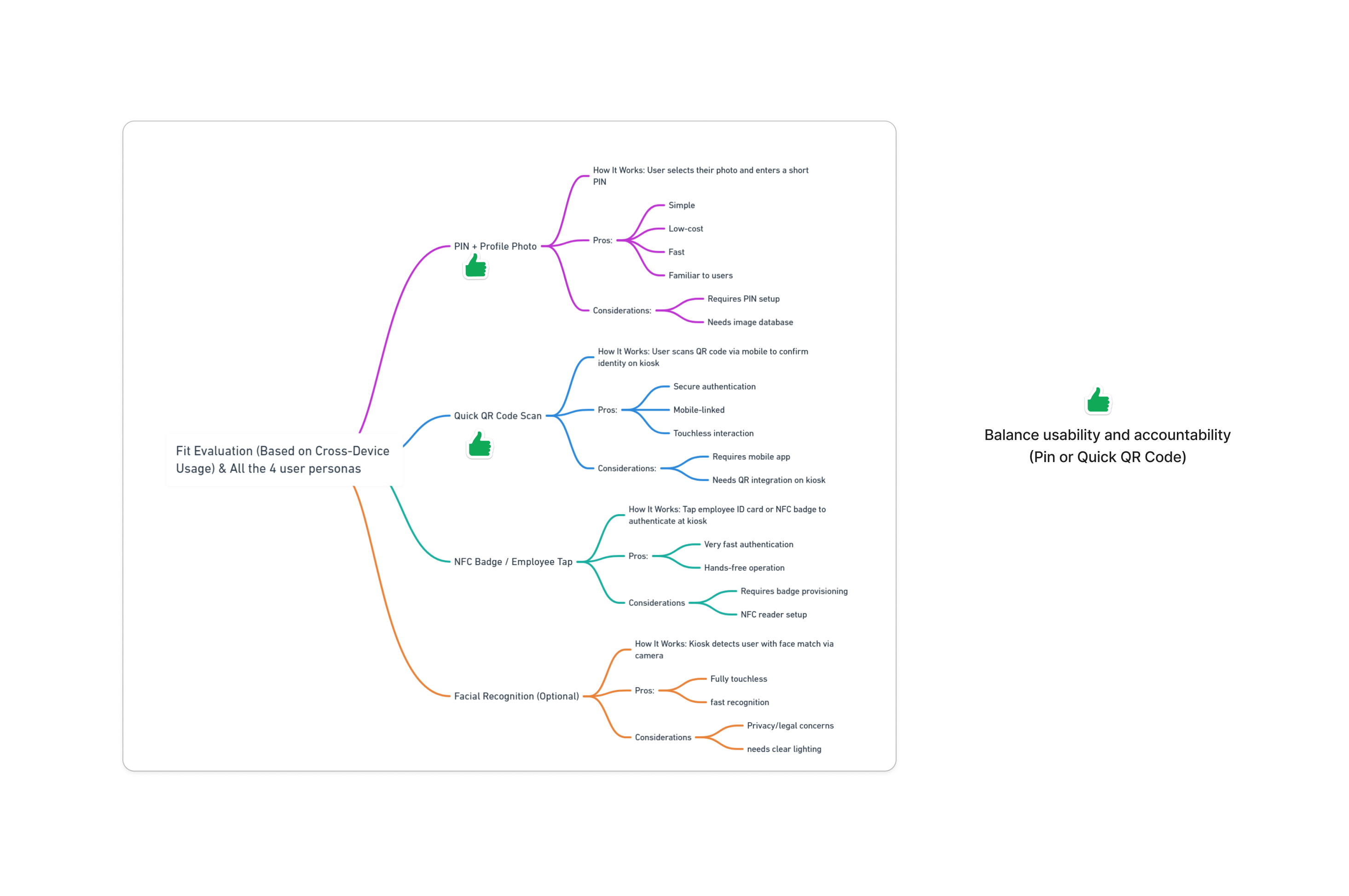
Balance usability and accountability — PIN or Quick QR Code.
Prioritising the tasks done most
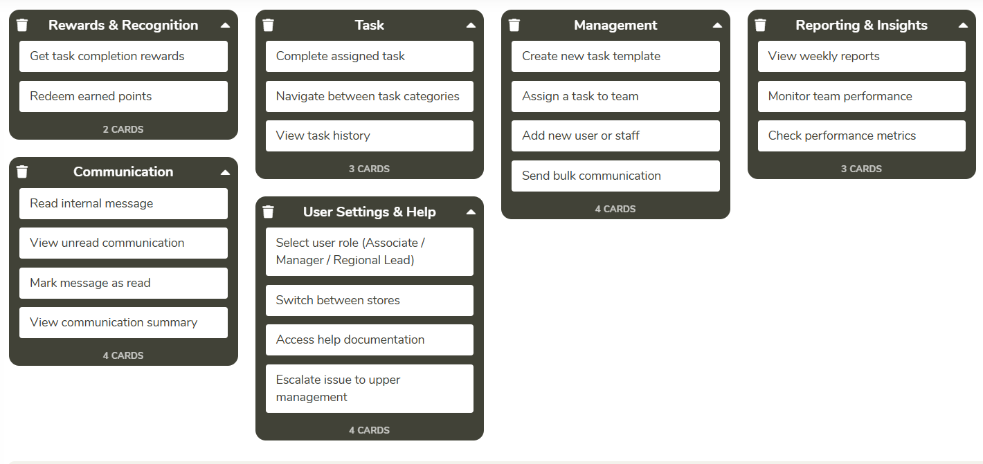
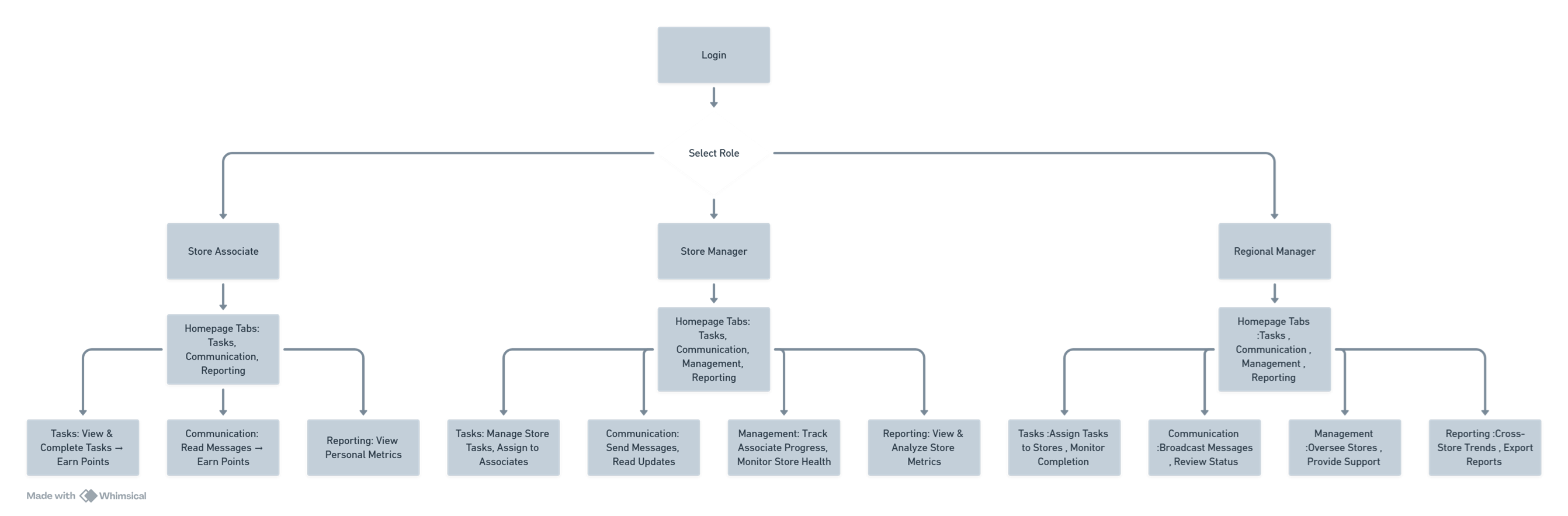
With a deeper understanding of user roles and workflows, I defined a design strategy that prioritized the tasks users performed most frequently while addressing the highest-impact usability issues. For the first release, the focus was on delivering targeted improvements within the constraints of the existing platform, balancing user needs with technical feasibility.
User flows were simplified and the information architecture was restructured to create a clearer navigation model, improve content discoverability, and support efficient task completion across Web, Kiosk, iPad, and Mobile.
11: Design Iterations & Rationale
Iterations — Three-Way Comparison
Three structurally different ways of surfacing the same task list were sketched and compared before committing to one direction.
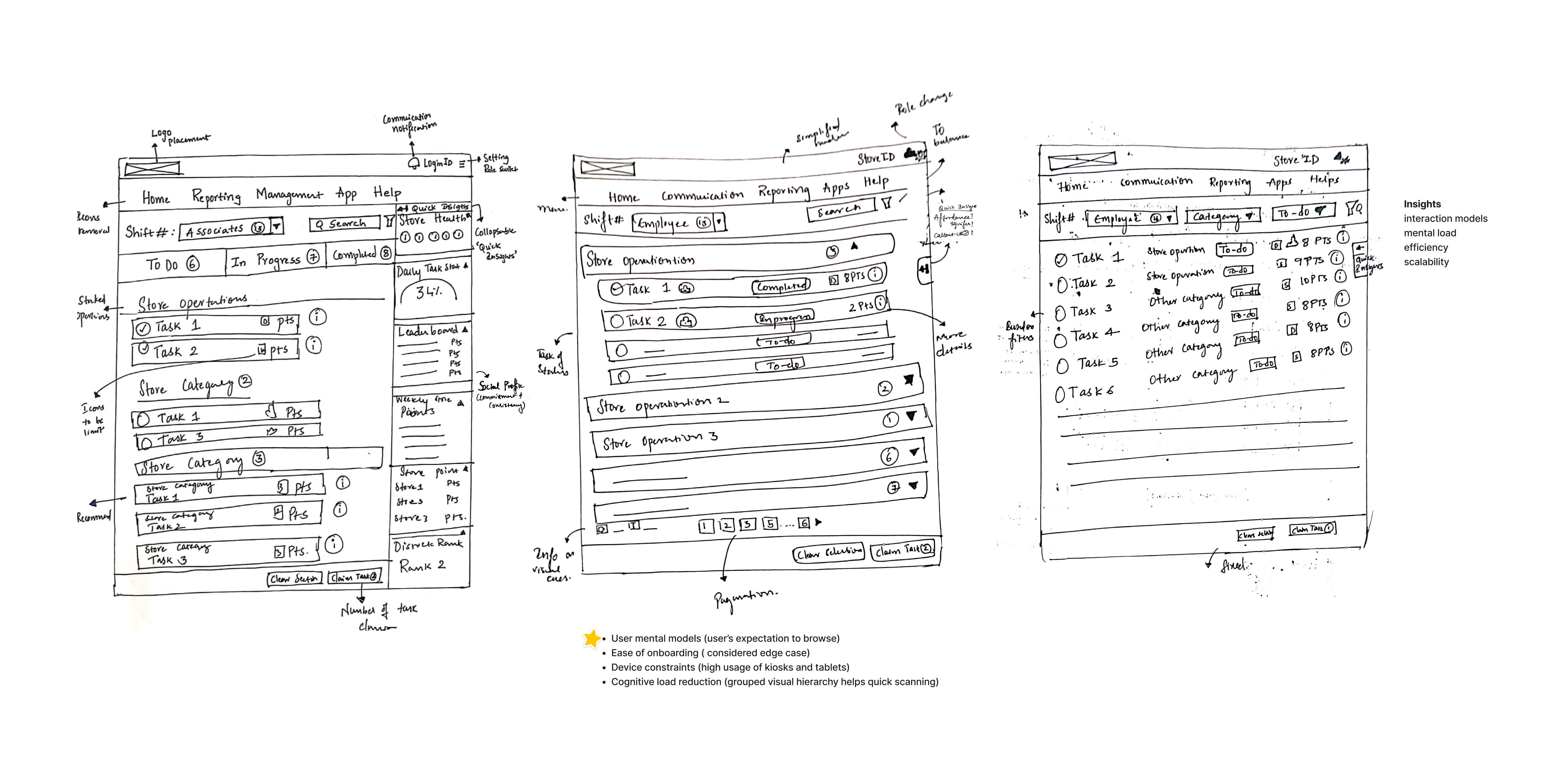
- User mental models (user's expectation to browse)
- Ease of onboarding (considered edge case)
- Device constraints (high usage of kiosks and tablets)
- Cognitive load reduction (grouped visual hierarchy helps quick scanning)
Design Decisions & Rationale
Ten decisions carried through to the shipped interface, each weighed against the principle it served and, where one existed, the alternative it replaced.
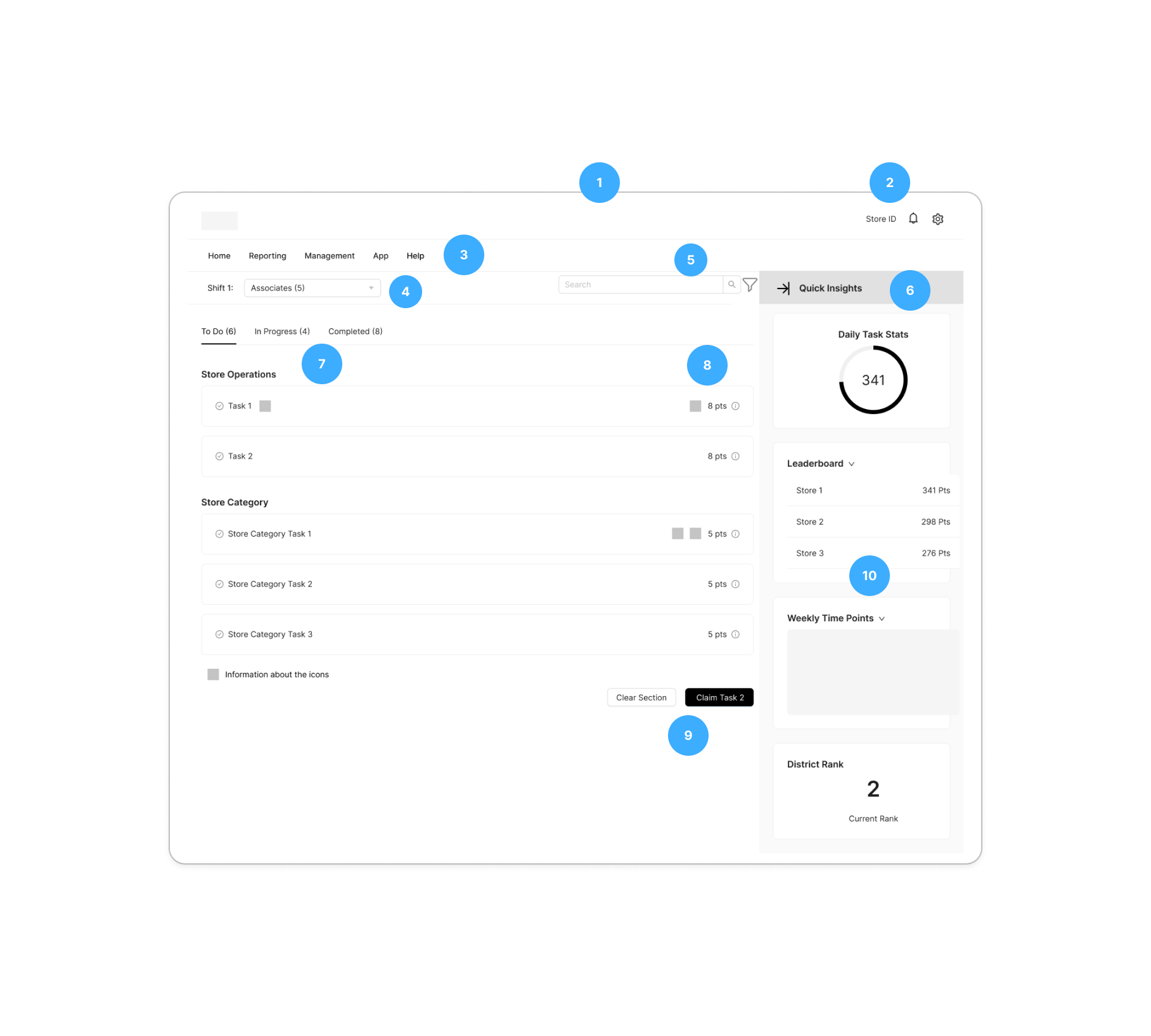
| # | Design Decision / Change | Rationale | Principle(s) Applied | What Was Rejected | Stakeholder Alignment / Pushback |
|---|---|---|---|---|---|
| 1 | Simplified Top Navigation Bar, Less Is More | Reduce visual noise and improved scannability | Simplicity First, Design for Digital Literacy | – | Agreed after heuristic review exposed cognitive load |
| 2 | Persistent Store ID display, icon restyling (Settings vs Hamburger), and relocation of communication alerts | Improve clarity of session ownership, reduce screen clutter, and improve access to communication alerts | Feedback and Transparency, Role-Based Clarity, Simplicity First | Notification bell for alerts was rejected (kept comms tab in view); Settings icon was reverted to Hamburger | Switched settings and alert icons were reverted after A/B testing showed potential cognitive friction. Stakeholders felt employees might miss updates; we aligned with familiar UI cues. |
| 3 | Grouped related features via card sorting; removed icons from top navigation | Avoided horizontal scroll on smaller screens, which impairs usability more than removing icons. Prioritized clarity and tap targets over visual cues. | Simplicity First, Consistency Across Devices, Design for Digital Literacy | – | Stakeholders supported the trade-off based on screen limitations. |
| 4 | Role Filter for task view | Limit task visibility to relevant roles to reduce misuse and clutter, especially on mobile | Frictionless Accountability, Role-Based Clarity, Consistency | Role-based restrictions; stakeholders preferred full visibility to support transparency. Highlighted risks and planned to monitor experience across mobile and large screens. | Stakeholders opted for full visibility to support transparency. Highlighted risks and planned to monitor experience across mobile and large screens. |
| 5 | Proposed global filter and search bar for task discovery | Intended to improve task discoverability across large volumes | Simplicity First, Progressive Disclosure | Filter and search were rejected due to tech limitations and business belief that users prefer browsing known task categories | I aligned with their decision, for this specific context, browsing was indeed faster and more intuitive than search. |
| 6 | Collapsible "Quick Insights" module | Intended to reduce clutter while offering task summaries | Progressive Disclosure, User Control, Simplicity | Due to technical constraints | The concept was accepted, but due to delivery timelines and technical constraints it was not proposed. I wonder if the final solution fully supports users with lower design literacy or familiarity |
| 7 | Segmented Task Tabs | Tried segmented view to showcase all the tasks | Clarity, Familiarity | Flat segmented task view (caused long scroll, low clarity) | Accordion matched the existing mental model and was more usable within tech and layout limits |
| 8 | Simplified Visual Cues, Visual Metaphors communicate faster | Reduced non-essential icons to minimize visual noise and support quicker recognition | Cognitive Load Reduction, Visual Clarity, Recognition Over Recall | – | Simplified cues were well-received, helped users remember critical indicators without unnecessary distractions |
| 9 | Key actions placed as a fixed, always-visible bar above the fold. | Placed key actions as fixed CTAs above the fold for easy access, even during long scrolls. | Visibility, Ease of Use, Fitts's Law | – | Fixed CTA placement minimized movement effort and made actions instantly accessible during long scrolls, improving task efficiency. |
| 10 | Reorganized "Quick Insights" Content | – | Relevance, Cognitive Load Reduction, Gestalt Principles (Proximity, Hierarchy), Progressive Disclosure | – | Initial testing showed users skipped over dense insights. Layout was refined to group related data visually and surface only the most relevant information using visual hierarchy and spatial grouping. |
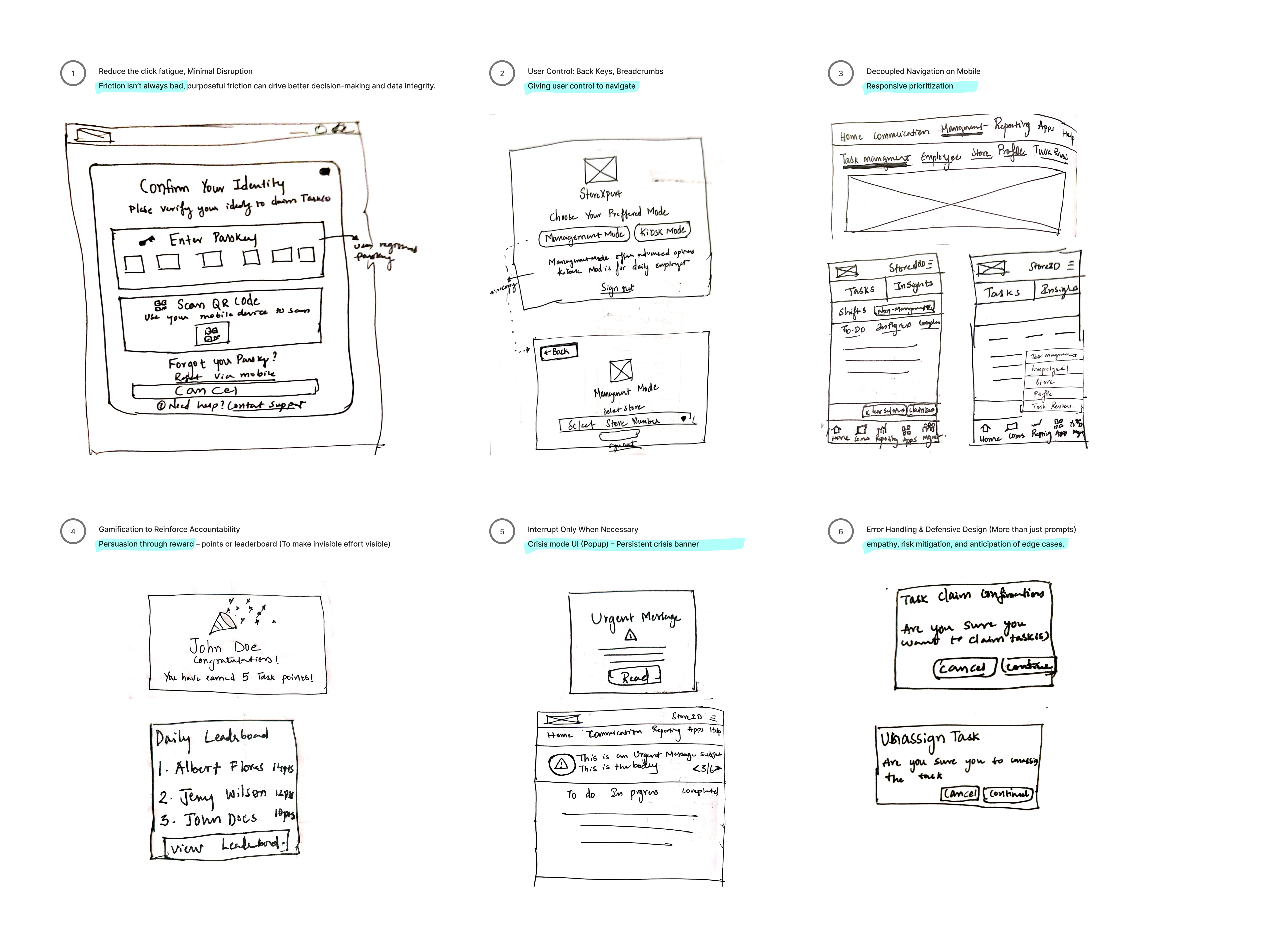
High-Impact Design Decisions
12: Wireframes
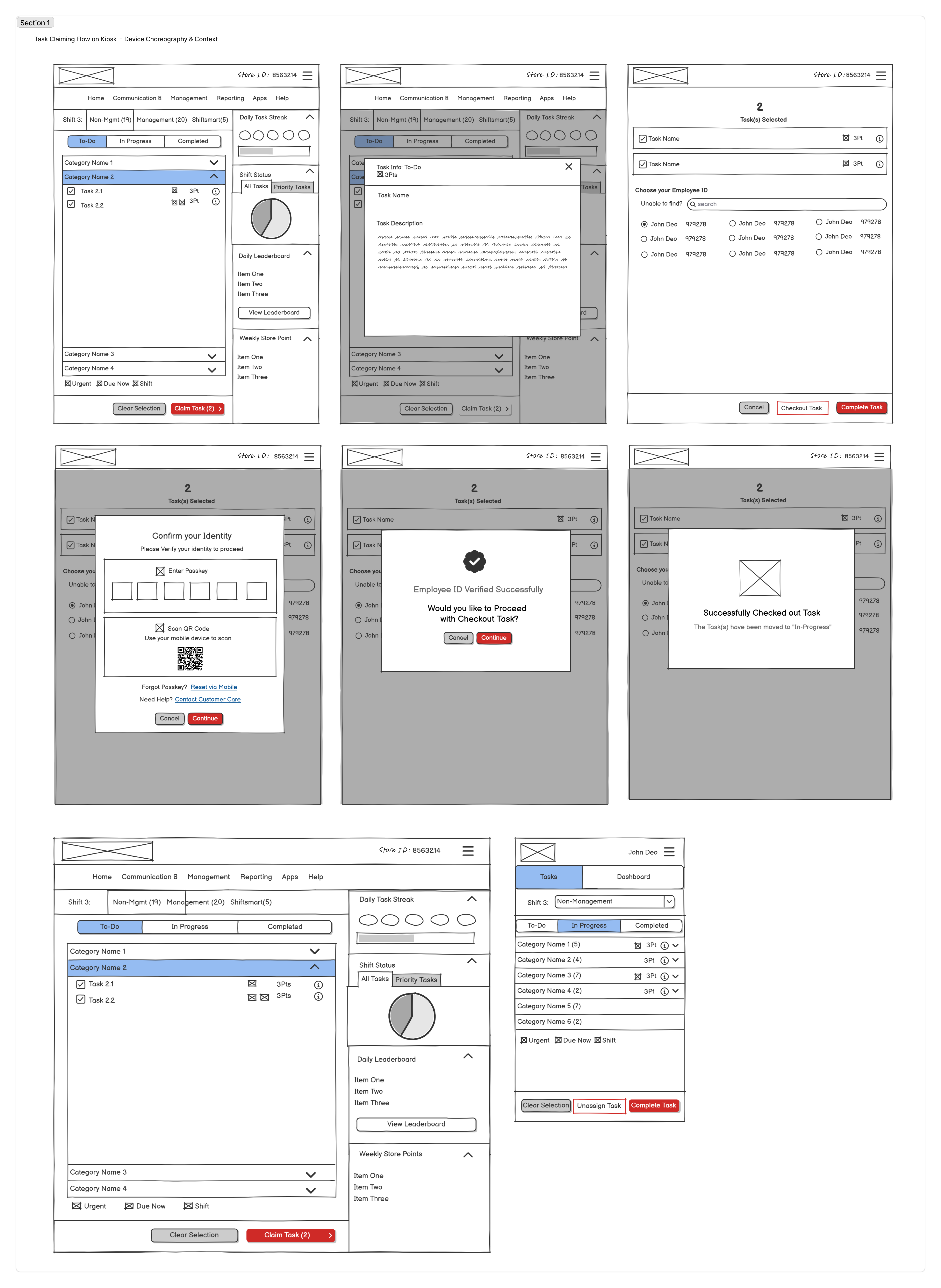
Task Claiming & Checkout Flow
Low-fidelity wireframes covering task selection through identity verification and checkout, before any visual design was applied.
Design Principles
Simplicity First
Consistency Across Devices through (Responsiveness & Adaptability)
Scalability through patterns and reusable components
Design for Digital Literacy
Accessible and Inclusive UX
Frictionless Accountability
Cross-device continuity
Progressive Disclosure
Feedback and Transparency
13: Design System
One component, four platforms
To support a multi-platform experience and accelerate delivery, I developed a modular design system in Figma using Material UI as the foundation. Reusable components, standardized interaction patterns, and responsive layouts reduced design duplication and simplified developer implementation, contributing to a 20% reduction in design and development effort across the project.
14: Iteration
Weekly reviews instead of handoff
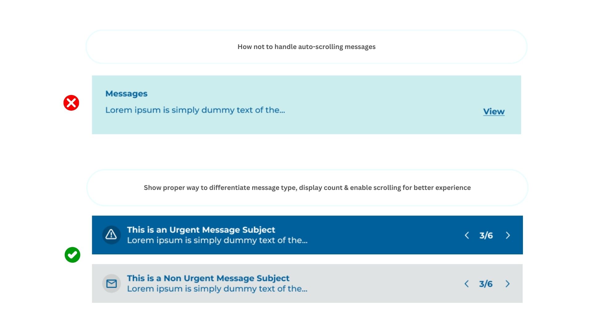
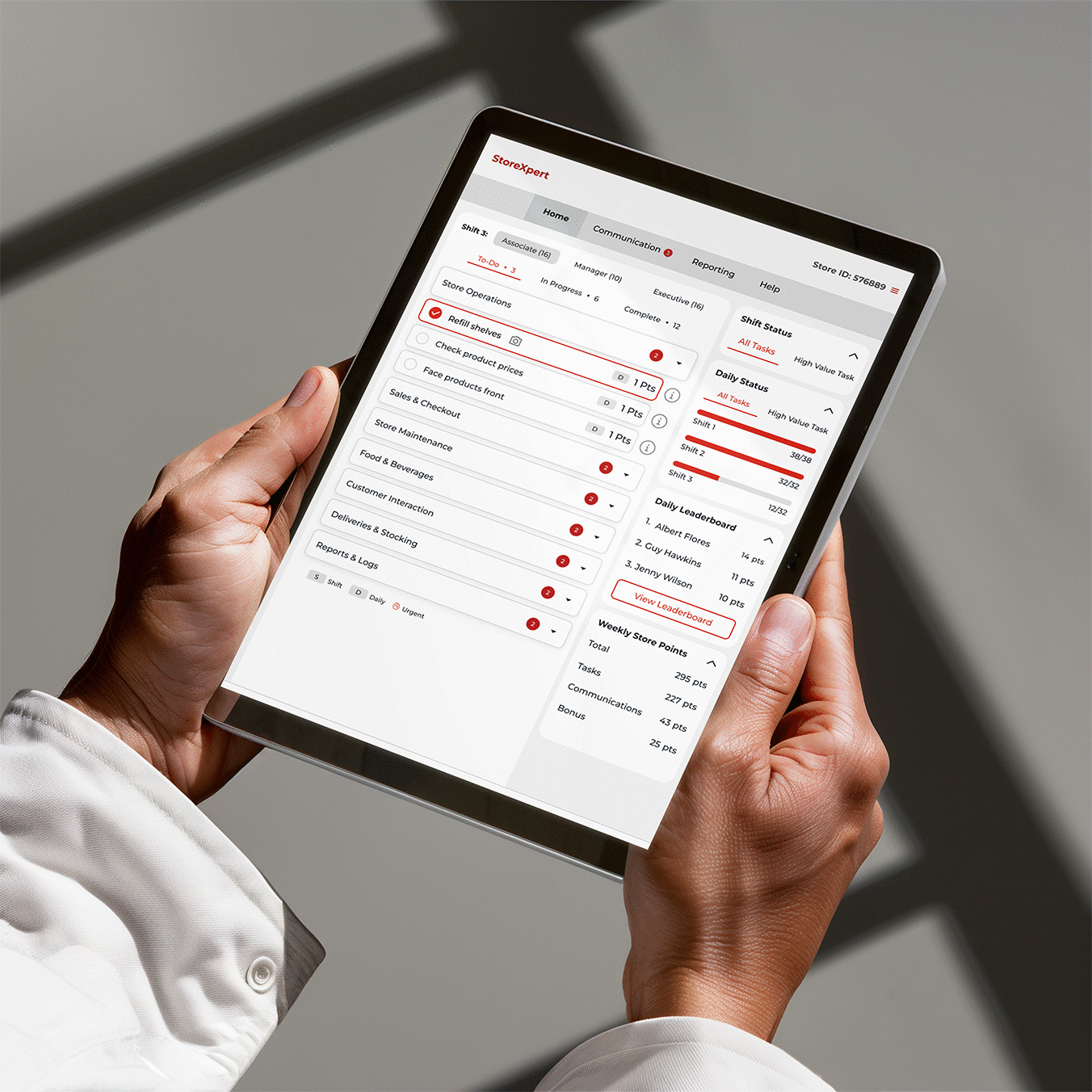
With an accelerated delivery timeline, the design process followed a continuous feedback loop rather than a linear handoff. Weekly design reviews with the Business Analyst and development team were used to validate technical feasibility, refine workflows, and align implementation priorities.
Close cross-functional collaboration enabled rapid iteration while maintaining consistency with the design system, adhering to brand guidelines, and keeping the solution focused on the agreed project scope. This iterative approach reduced rework and ensured a smooth transition from design to development.
15: Accessibility
Tested during design, not after
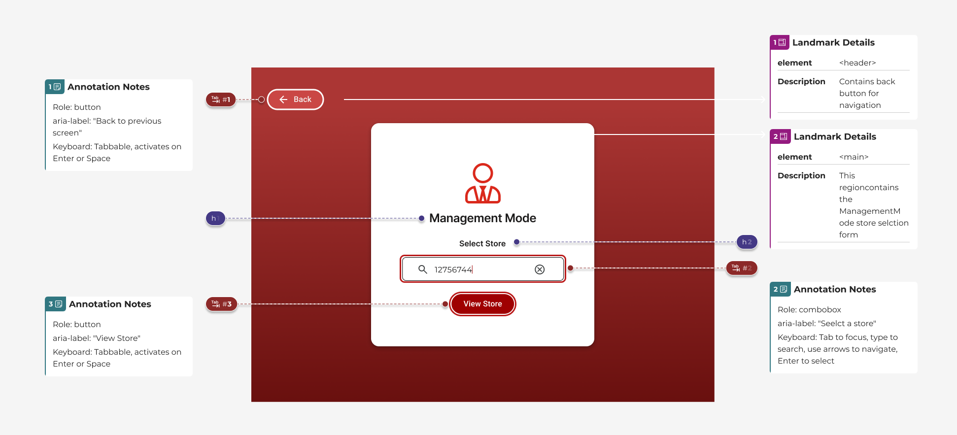
Accessibility was embedded throughout the design process rather than treated as a final compliance check. The experience was designed to align with WCAG 2.1 AA guidelines, ensuring users could navigate and complete tasks confidently across different devices and assistive technologies.
Key Accessibility Considerations
Colour & Contrast
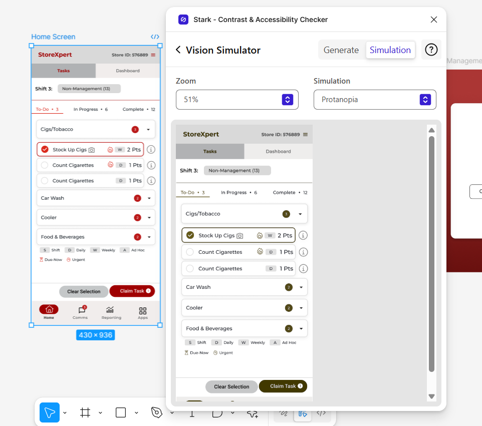
Ensured text and interactive elements met WCAG 2.1 AA contrast requirements to improve readability and support users with colour vision deficiencies.
Keyboard Navigation
Designed clear focus states and a logical tab order, enabling efficient navigation without relying on a mouse.
Semantic Structure
Established a consistent heading hierarchy and meaningful semantic structure to improve screen reader compatibility.
Assistive Technology Support
Applied appropriate ARIA labels and interaction states to provide context and feedback for assistive technologies.
16: Prototyping & Handoff
A single source of truth for engineering
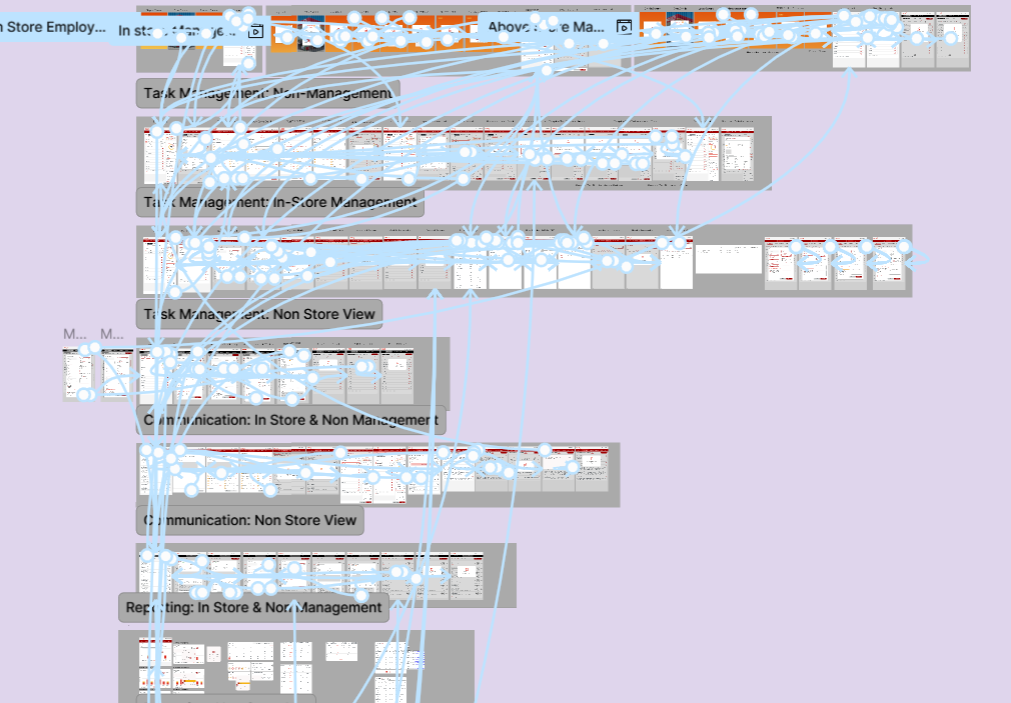
High-fidelity interactive prototypes were developed across Web, Mobile, Kiosk, and iPad to validate key workflows, responsive behaviours, and interaction patterns before implementation.
To support a seamless transition into development, I delivered comprehensive handoff documentation including annotated specifications, reusable components, design tokens, accessibility guidance, and a shared design system. This established a single source of truth for engineering and helped accelerate implementation while maintaining design consistency.
17: Decisions
Decision 01
One modular design system, not four separate redesigns
What was true
The same task views had to work as a kiosk touch interface, a store manager's iPad, a phone in an associate's hand, and a desktop web view, and every prior update meant editing all four separately.
What I chose
Built a component-based design system in Figma, tailored to the brand and to StoreXpert's structure, so a single change to a component propagated automatically across every device view.
What I moved away from
Redesigning each platform's screens independently for speed. It would have hit the Phase One deadline faster but guaranteed the same maintenance problem the project was meant to fix.
What it cost
Slower to the first shippable screen, because the system had to be built before most individual screens could be finished.
Decision 02
Phase One is disciplined enhancement, not a rebuild
What was true
Initial analysis found real structural problems (cluttered headers, inconsistent presentation of the same information, invisible system feedback), but store teams also depended on the system being recognisable from one release to the next.
What I chose
Scoped Phase One to the highest-severity usability violations and kept the existing structure largely intact, so store staff experienced continuity, not a relearn.
What I moved away from
A full IA and visual overhaul in one release. It scored better on paper but risked the operational disruption the client was explicitly trying to avoid.
What it cost
Some known issues (lower-severity, lower-occurrence ones) were deliberately left for a later phase rather than fixed immediately.
Decision 03
Design for the store floor's accessibility needs, not just compliance
What was true
Store associates use this system standing at a kiosk, often quickly, in variable lighting, conditions where colour-contrast and keyboard/focus problems compound faster than they do at a desk.
What I chose
Validated every interactive surface against WCAG 2.1 AA using a colour-deficiency simulator and explicit keyboard-focus testing, not just automated contrast checks.
What I moved away from
Treating accessibility as a final QA pass against a checklist. Testing with a vision simulator during design, not after, changed specific component choices.
What it cost
Added a review step to every component before it entered the system library, which slowed the system's initial build-out.
What the Team Said
“Nithya is a brilliant designer and leader, always tackling challenges with a forward-thinking approach. She consistently overdelivers, making her a valuable asset to any team!”
“Great job! Thanks for your support in refining the StoreXpert proposal and crafting an efficient cross-platform design. A fantastic effort in re-imagining the application for future readiness!”
18: Reflection
From shaping the proposal to delivering the final experience, this project strengthened my ability to bridge business goals, user needs, and technical feasibility through design.